the taylor team
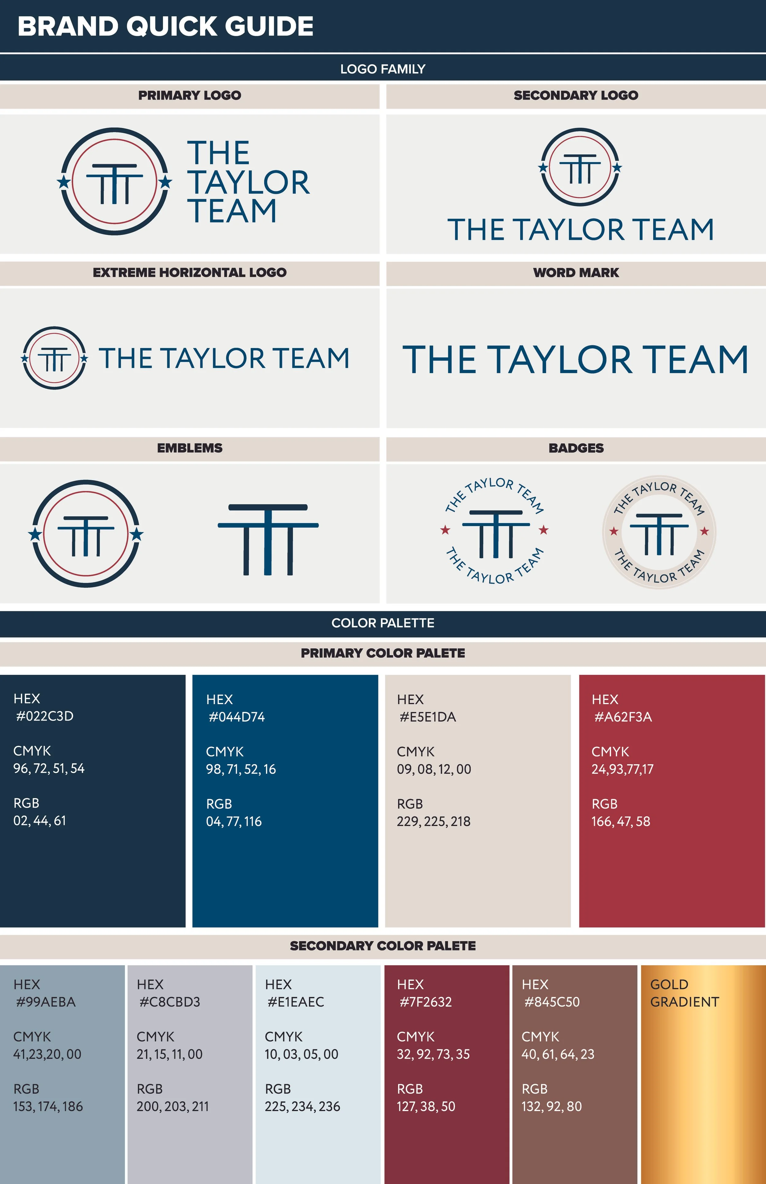
A ranch-honest, service-forward Realtor brand that weaves faith and military heritage into a modern, curb-appealing system.
Jason and Brooklyn asked for a brand that stood out in a crowded Realtor market and felt “ranch” while reflecting who they are: a Marine Corps family rooted in their faith. I built the identity around the alliteration in “The Taylor Team,” using three capital T’s to create an intersection that reads as a subtle cross. Arcing strokes shape a mark that feels like a cattle brand, and a minimal star set nods to Jason’s service. The palette is a deep, muted interpretation of red-white-blue to keep the patriotic thread while leaning into earthy warmth. Paired with a clean, highly legible type system, the result is a cohesive brand that’s instantly recognizable at street distance and polished up close—confident, neighborly, and true to the Taylors’ story.


how they applied
the brand

social


merchandise

Working with the Taylors, we outlined the different pieces that needed to build out their visual impact for all touchpoints they have with their clients throughout the journey of buying or selling a home.

business cards, letterhead, and email signatures


signs


